
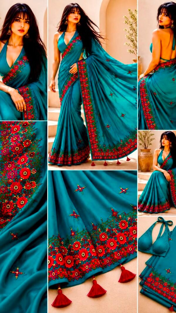
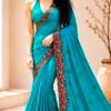
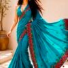
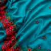


Bahar Crepe Saree in Teal with Hand-Embroidered Red Floral Border and Sequin Work
Sarees₹12,000.00
& Free ShippingBahar means spring.
The Urdu and Persian word for the season
when the flowers arrive before the warmth does —
the red on the teal,
the colour before the season’s full arrival. Teal is the colour that is never only one thing:
blue when it stands beside green,
green when it stands beside blue.
Against the red of the border flowers,
it becomes peacock.
The red becomes crimson.
Each colour is the other’s most vivid version.
The embroidery needlewoman filled the border
with the spring vocabulary:
the large flower open at the centre,
the leaf below, the smaller flower beside it,
the border continuous as the season.
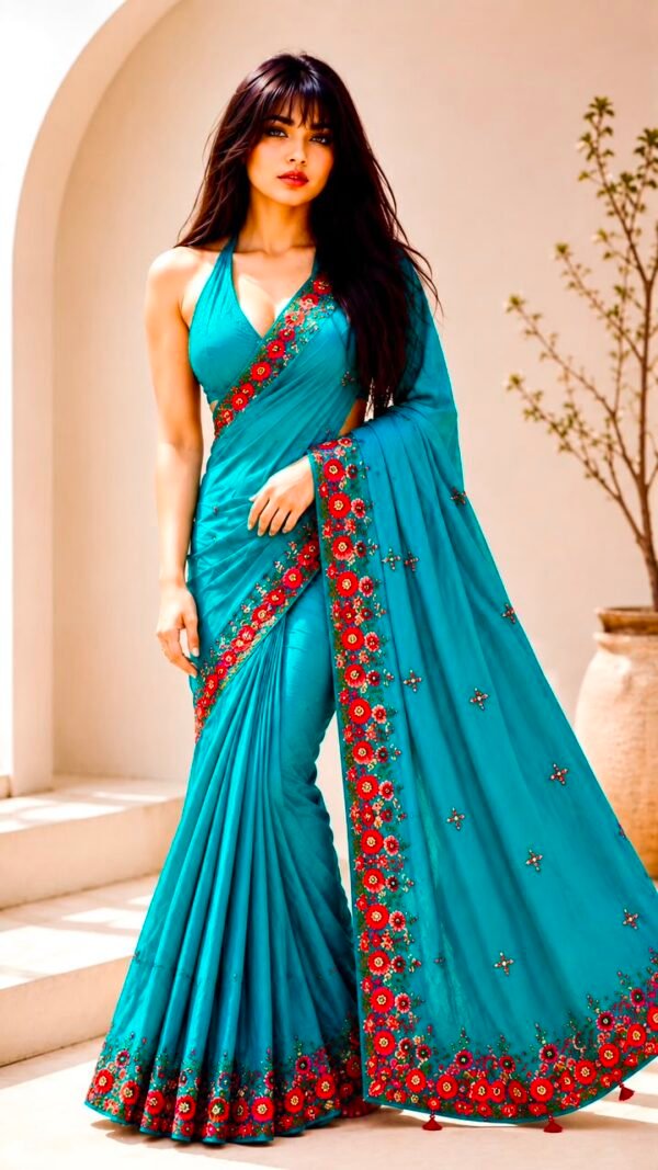
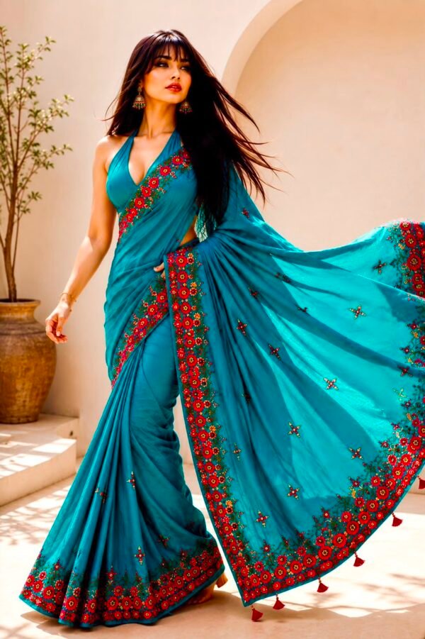
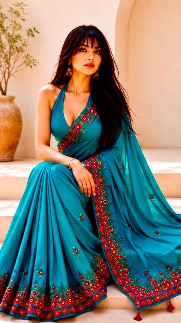
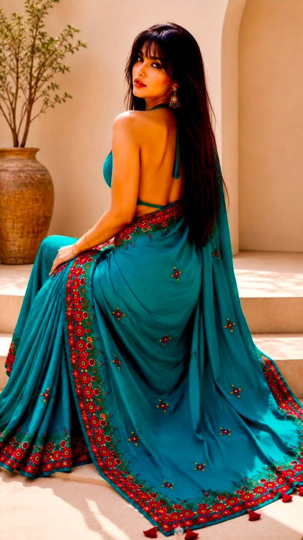
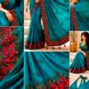
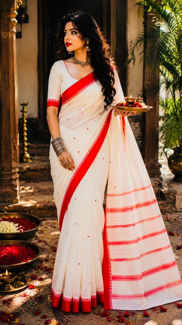
The three crepe sarees in the collection each make a different structural decision. Agni placed the embroidery at the pallu end of an orange-to-magenta ombre body. Mehndi placed the vine embroidery on a magenta pallu at the end of an olive-to-magenta ombre. Bahar places the embroidery not at the end but along the entire length: the red floral border runs the full 5.5 metres of the teal body, the garden present from the first centimetre to the last. The teal crepe body is plain and solid — no ombre, no gradient. The border is the sole embellishment. The decision concentrates all the craft at the saree’s edge.
Red on teal is the most visually active colour pairing in the crepe saree collection. The two colours are complementary in the optical sense: teal (a blue-green) and red (the warm counterpart of blue-green on the colour wheel) each make the other appear more saturated when placed in direct contact. The red flowers on the teal border do not simply rest against the teal ground — they activate it. The specific peacock blue-green of this teal, which might read as a calm colour in another context, reads as electric against the crimson flowers. The flowers become their brightest possible red. This is the colour argument the saree makes, and it is the most vivid argument in the crepe collection.
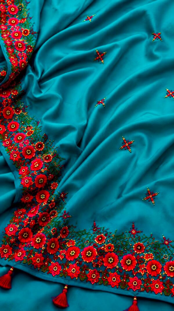
The border embroidery is a continuous garden composition: large red flowers in the zinnia or poppy vocabulary — each flower with a distinct circular centre and full rounded petals, the form immediately recognisable as a specific real flower type rather than a stylised geometric form — alternating with green leaf clusters and smaller multicolour flowers at the junctions. The embroidery is dense enough to cover the border band completely, the teal ground beneath the border not visible. Scattered small cross and star buti on the teal body above the border carry the embroidery vocabulary at a quieter scale across the plain body. Red tassels at the pallu hem complete the palette: the border’s crimson present at the hem’s end as well.
In the reference image, the teal and red composition stands against a clean warm terrace setting: white arched walls, a dried branch in a terracotta pot, natural light. The setting does not compete with the colour argument of the saree — the neutral warmth of the setting allows the teal and red to state their case without distraction. The name is Bahar: spring, the season when the red flowers arrive before the warmth does.
The running floral border embroidery on Bahar requires the needlewoman to maintain the garden composition across the full 5.5 metre border length without the pattern repeating visibly. A truly continuous border — where the flower placements, the leaf angles, and the smaller accent flower positions vary across the full length rather than repeating at a fixed interval — requires the embroiderer to make composition decisions at each section of the border rather than simply pressing a block or repeating a fixed unit. The Bahar border reads as a continuous garden rather than a repeated pattern because the composition varies.
The combination of hand embroidery and sequin work on the crepe base places two different embellishment types in close proximity: the embroidery thread of the floral forms and the reflective sequins scattered between and around the embroidery elements. The sequins introduce a light-catching quality to the border that the thread alone does not achieve — the garden visible both as a colour composition and as a textured surface that responds to changing light. The red tassels at the pallu hem are the finishing element that takes the border’s colour from the hem edge to the pallu’s hanging point.
- Wash: Dry clean only. The teal crepe, the red floral embroidery, and the sequins all require professional care.
- Red embroidery thread: The crimson red is the highest colour-release risk against the teal ground. Do not allow water contact. Dry clean for all washes.
- Tassels: The red tassels may release colour when damp. Keep away from the teal body and other garments when any moisture is present.
- Sequins: Handle the border with care. Do not catch or pull sequin areas.
- Do not: Machine wash, hand wash, wring, bleach.
- Iron: Low heat on the reverse side only. Never iron on the red floral border from the front.
- Dry: In shade. Teal is UV-sensitive.
- Store: Folded in clean tissue paper with the embroidered border face inward. Store away from direct light.
Reviews
There are no reviews yet.